PUMA RS-0
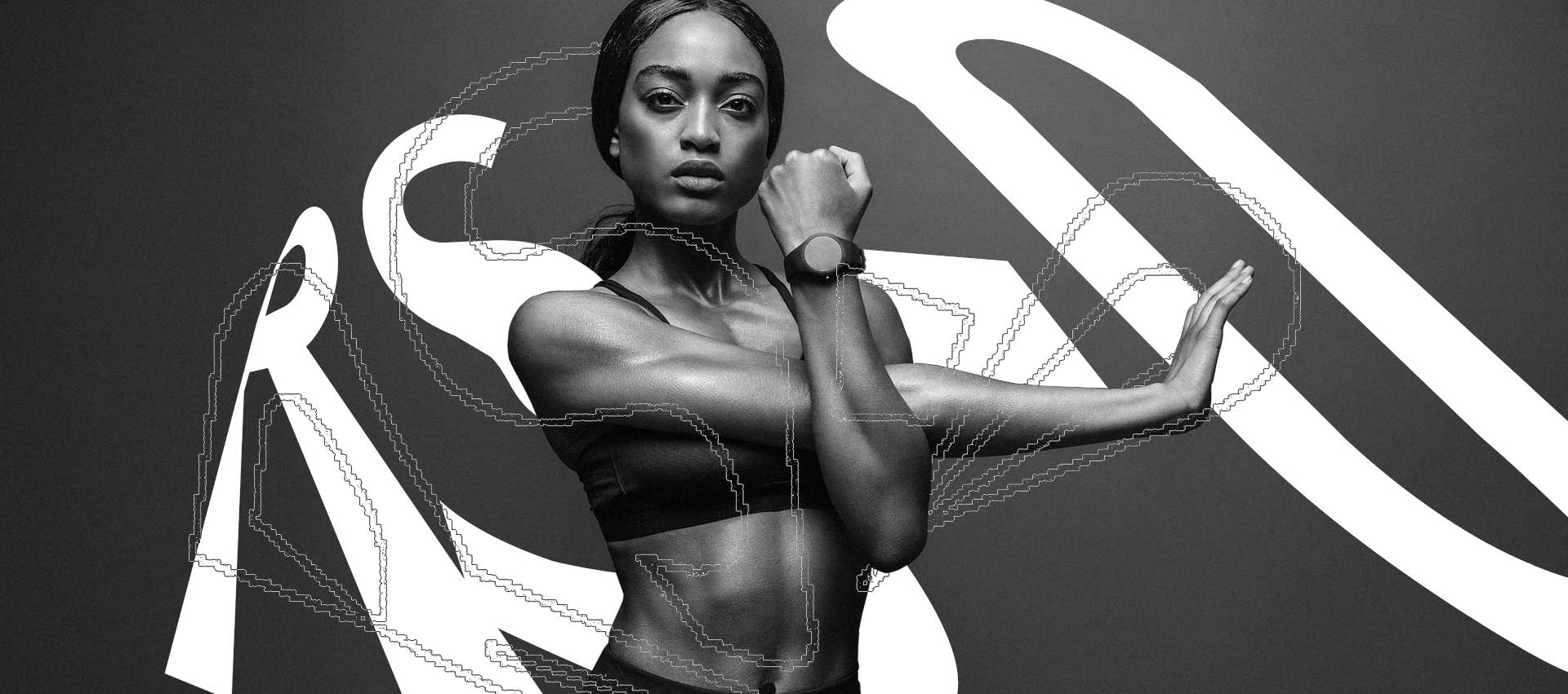
I was asked to develop two design concepts for the RS-0 campaign of Puma. Each of the concepts should use typography as a design basis, whether in static or moving images, in digital or physical media.
Concept 01 - Design Exploration
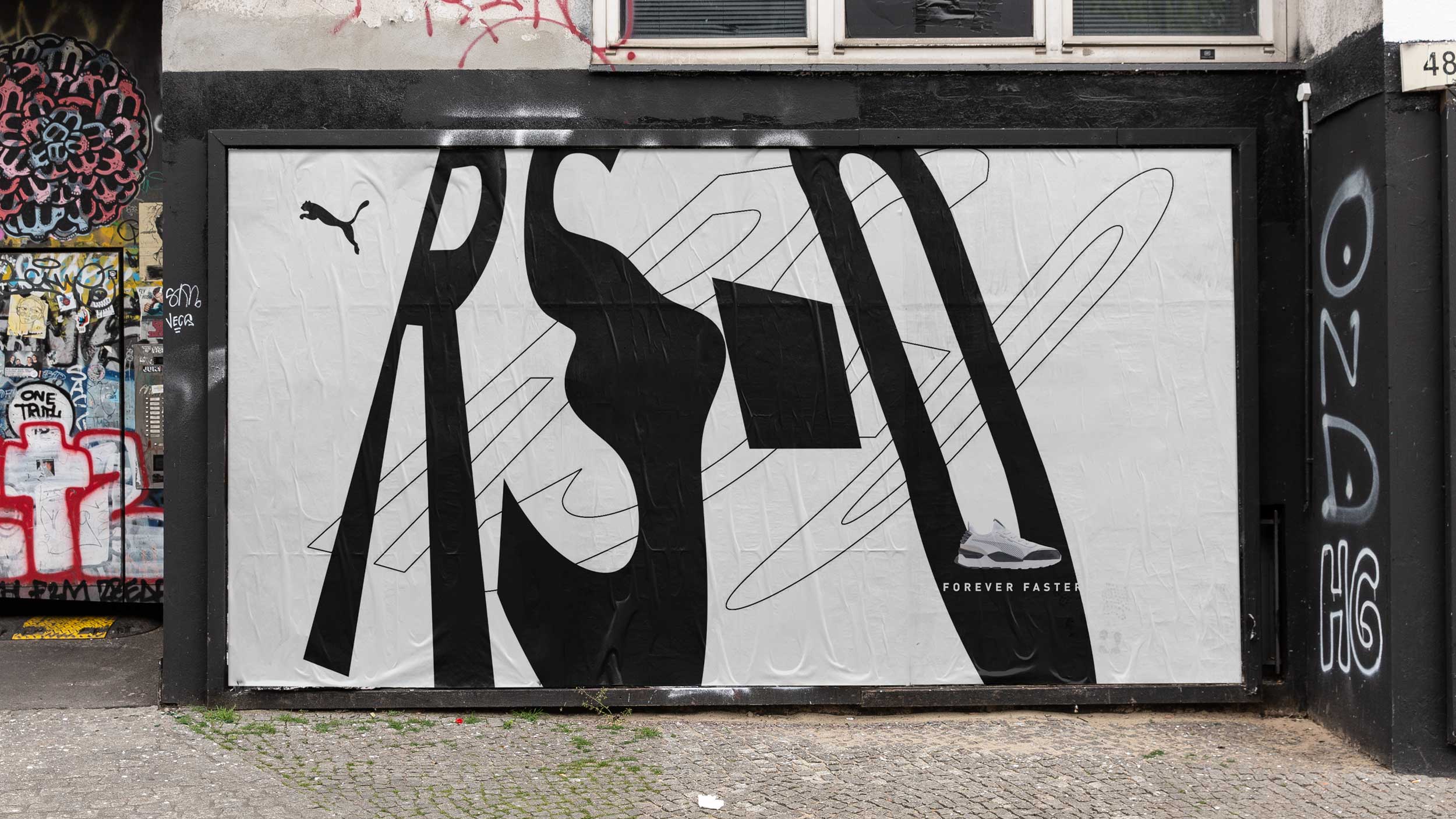
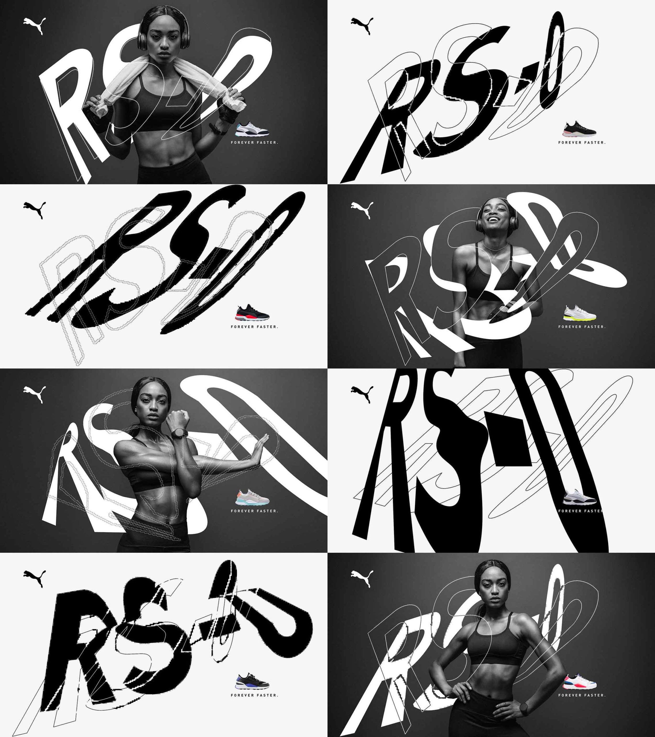
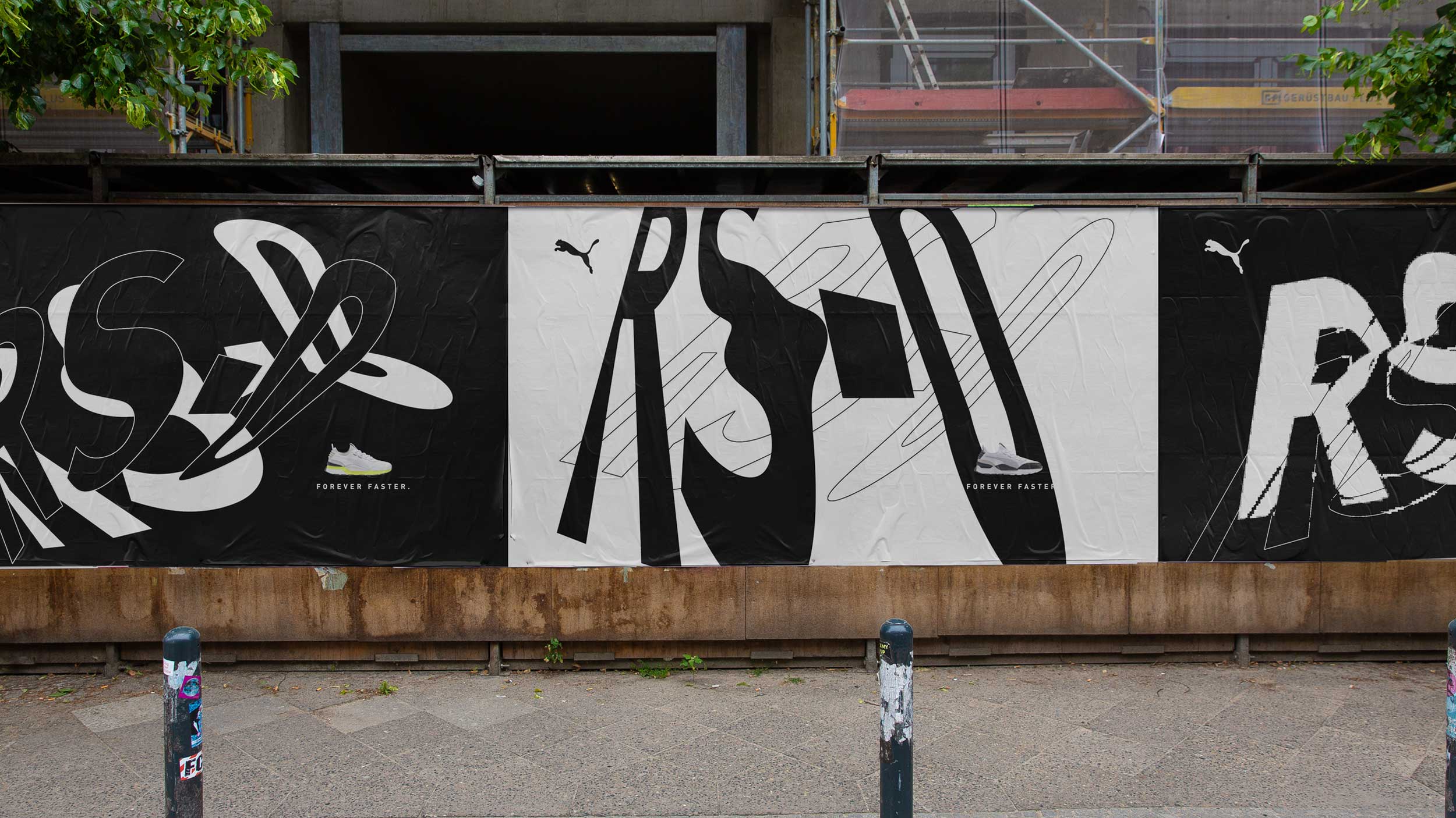
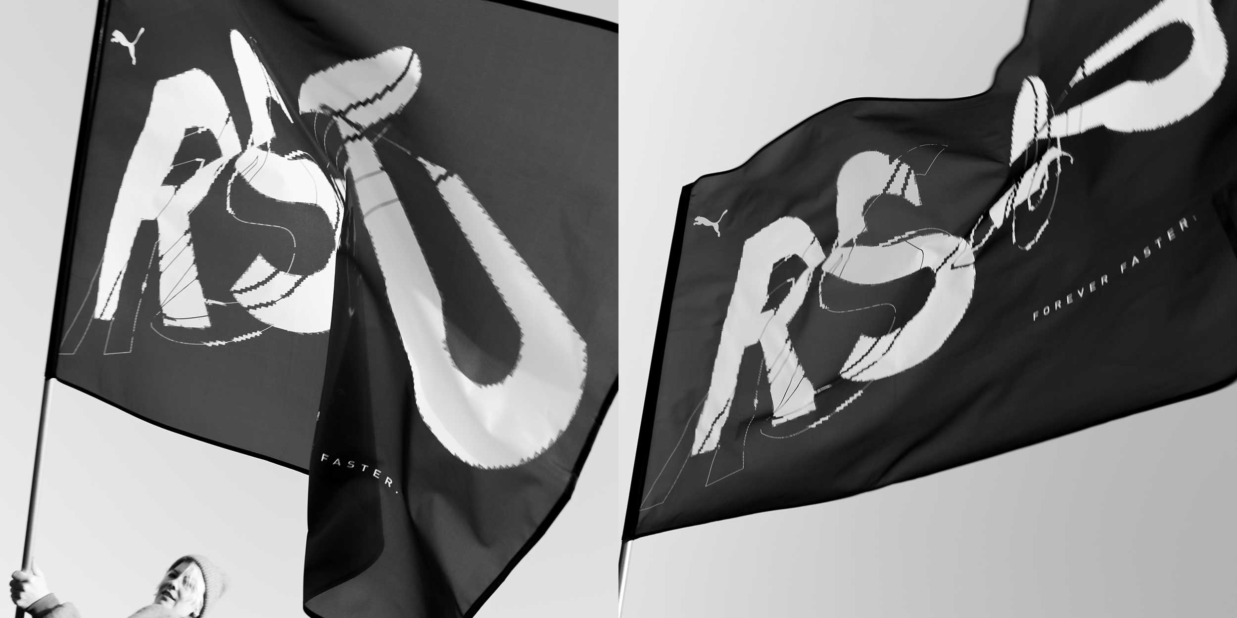
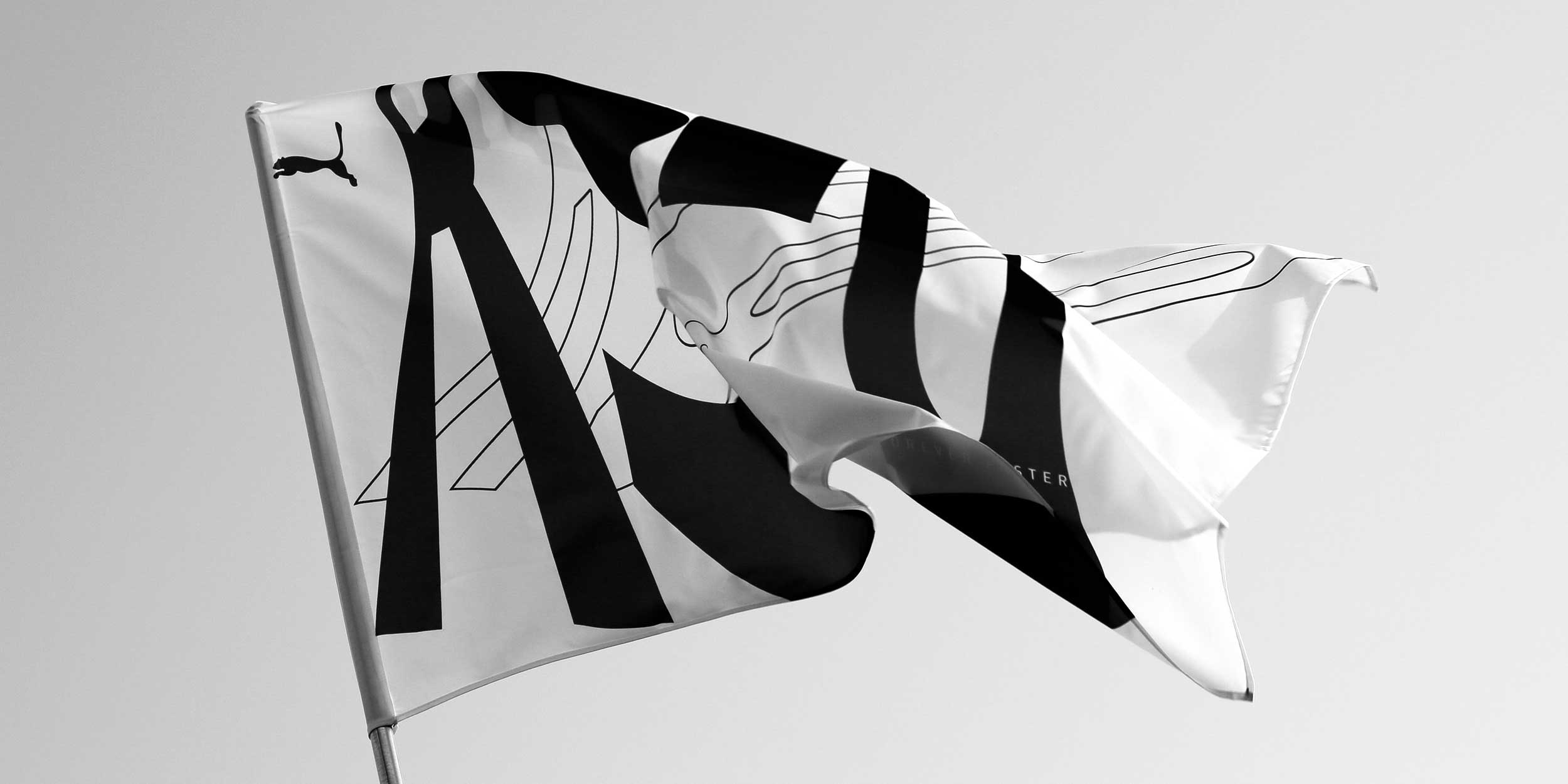
The first design approach focuses purely on the name of the collection, "RS-0". Here, colours and decorative elements were completely dispensed with and the lettering was distorted strictly graphically in perspective and scale. Through this strong abstraction and organic distortion, the name itself became a graphic. Although the design basis was always the "RS-0" and the Puma font "FF DIN for Puma", an unlimited number of designs can be created from it without losing the recognisability. In addition to the strictly graphic approaches, the graphics can also be combined with photos or videos.
Interactive Typography and Graphics
To bring the different features of the RS-0 closer to the client, I developed a wide range of interactive and generative animations. These were to be used in the social networks as well as in the Puma stores. The variety of different visuals was wide-ranging. On the one hand, very simple and slow graphics and loops were created, on the other hand, progressive and dynamic animations. In the end, a very large library of options was created for the different uses of the client.
Posters
Social Assets - Animation Preview
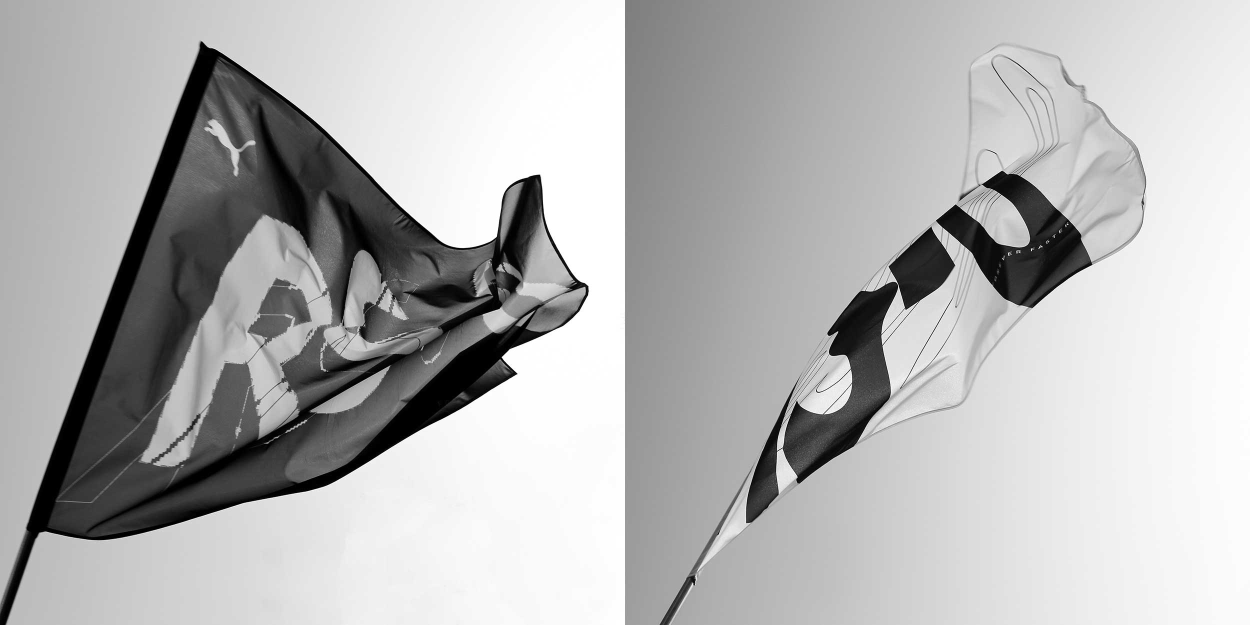
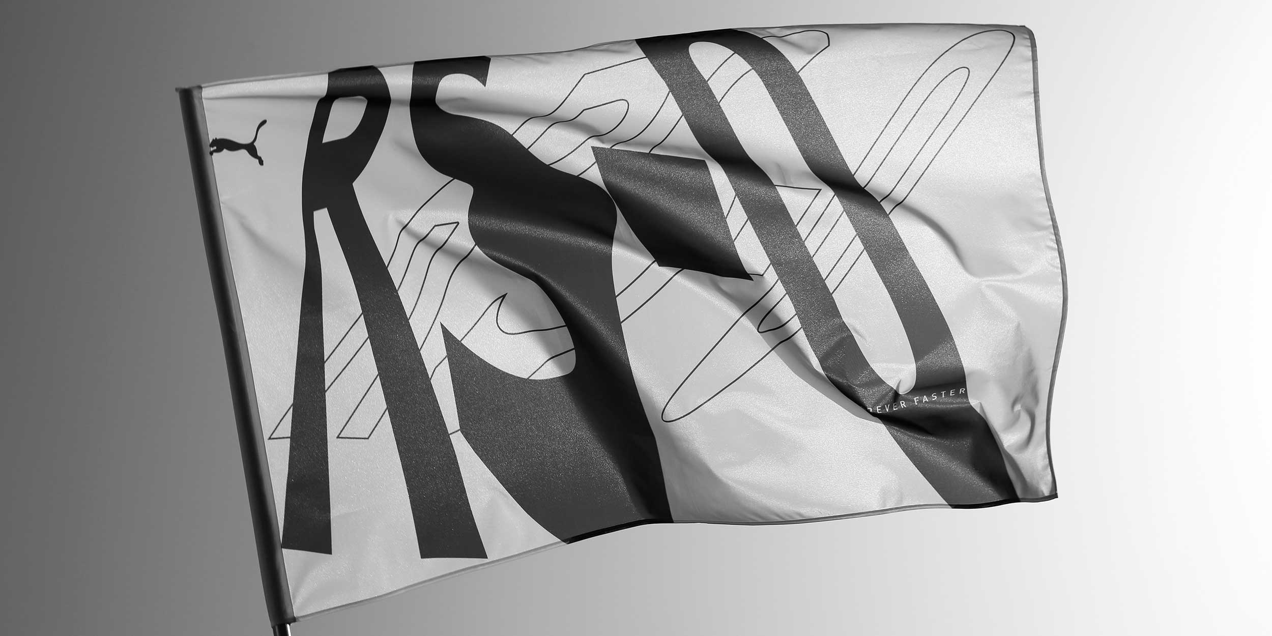
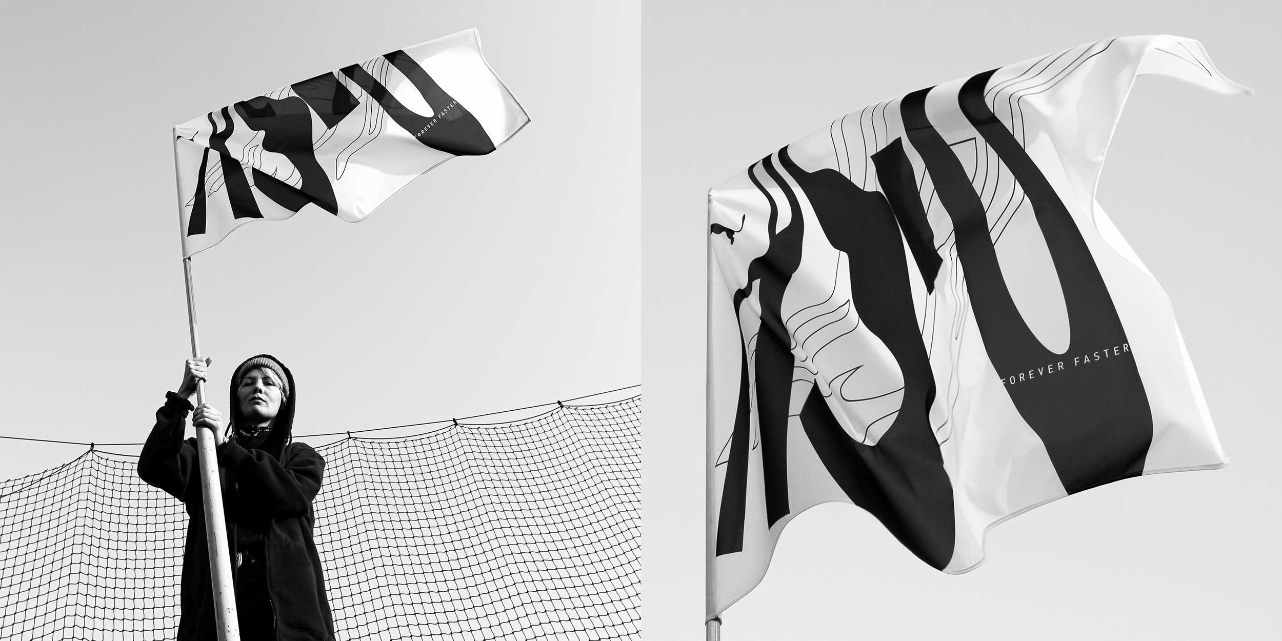
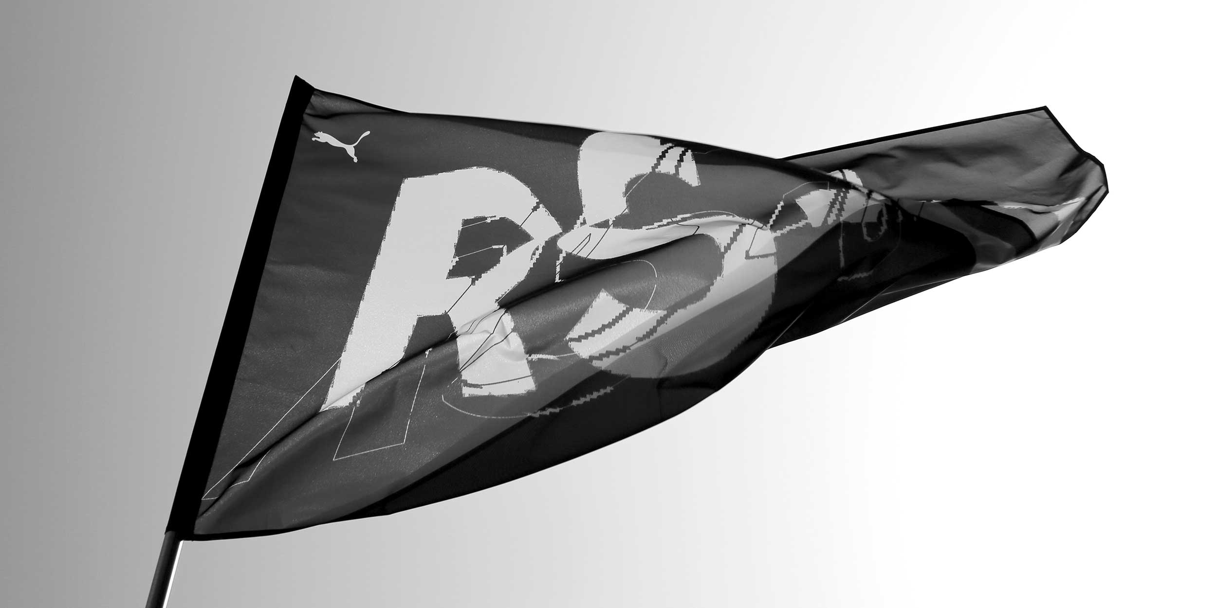
Promotional - Flags
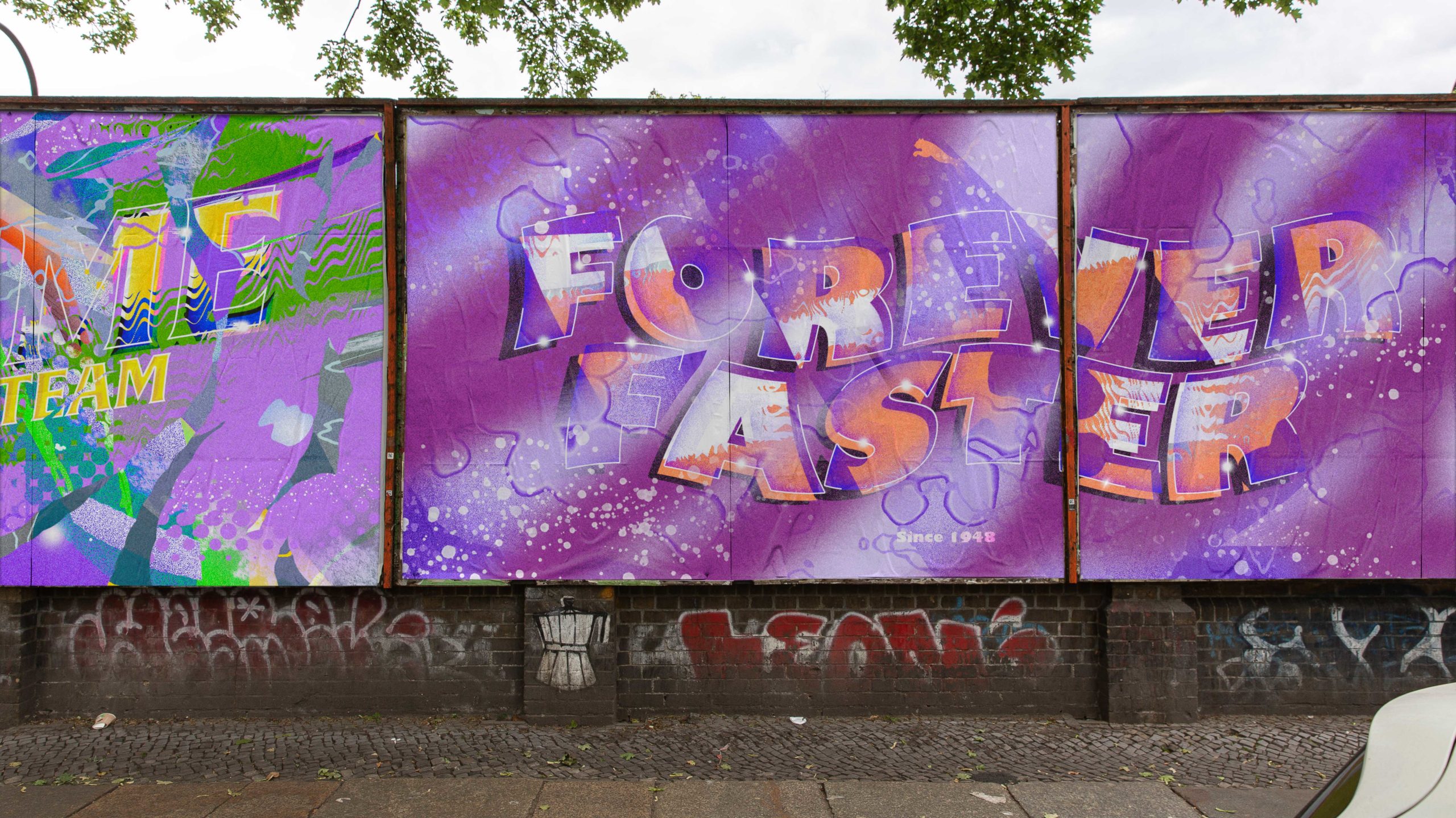
In addition to the purely digital media and the posters, the designs were to be used for other physical media such as flags, shirts or banners at events. Especially when playing with the flags, further exciting abstractions of the actual graphics were created.
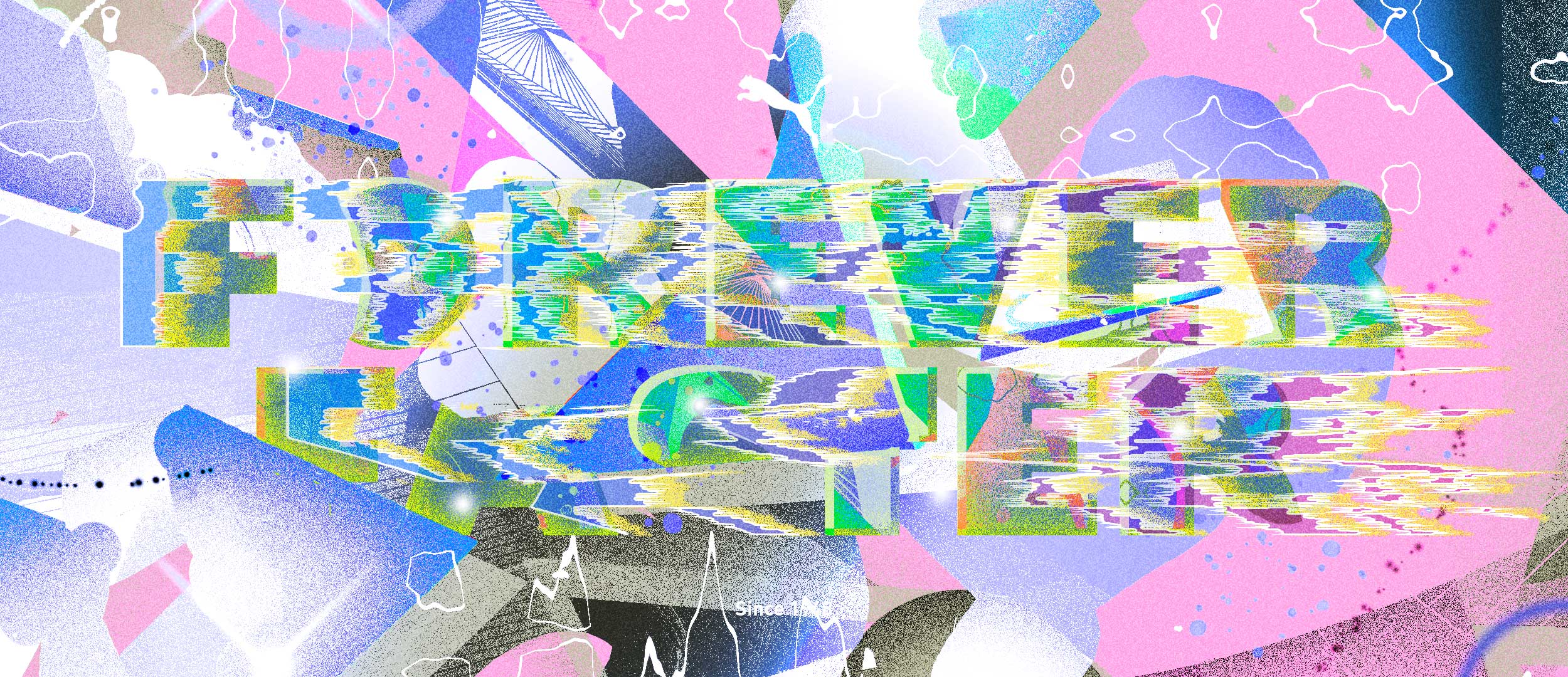
Glitches
Concept 02 - Oldschool Lettering
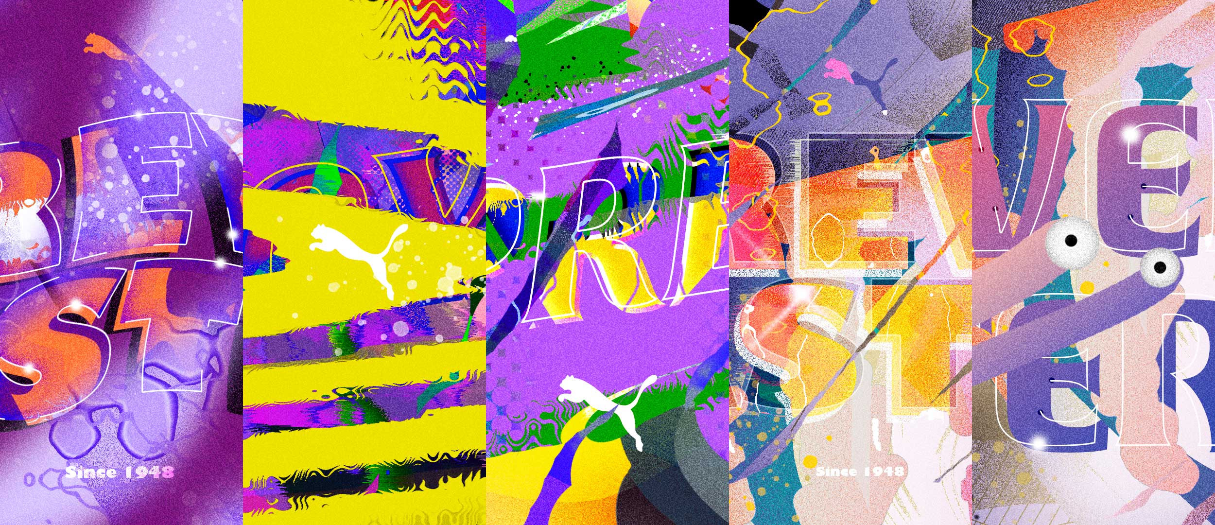
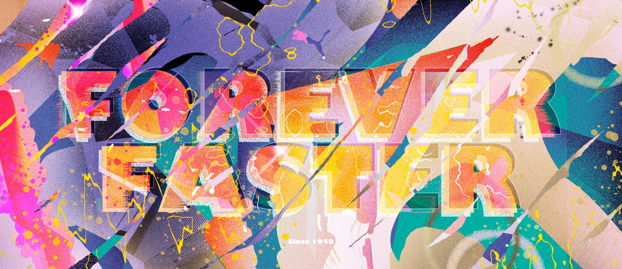
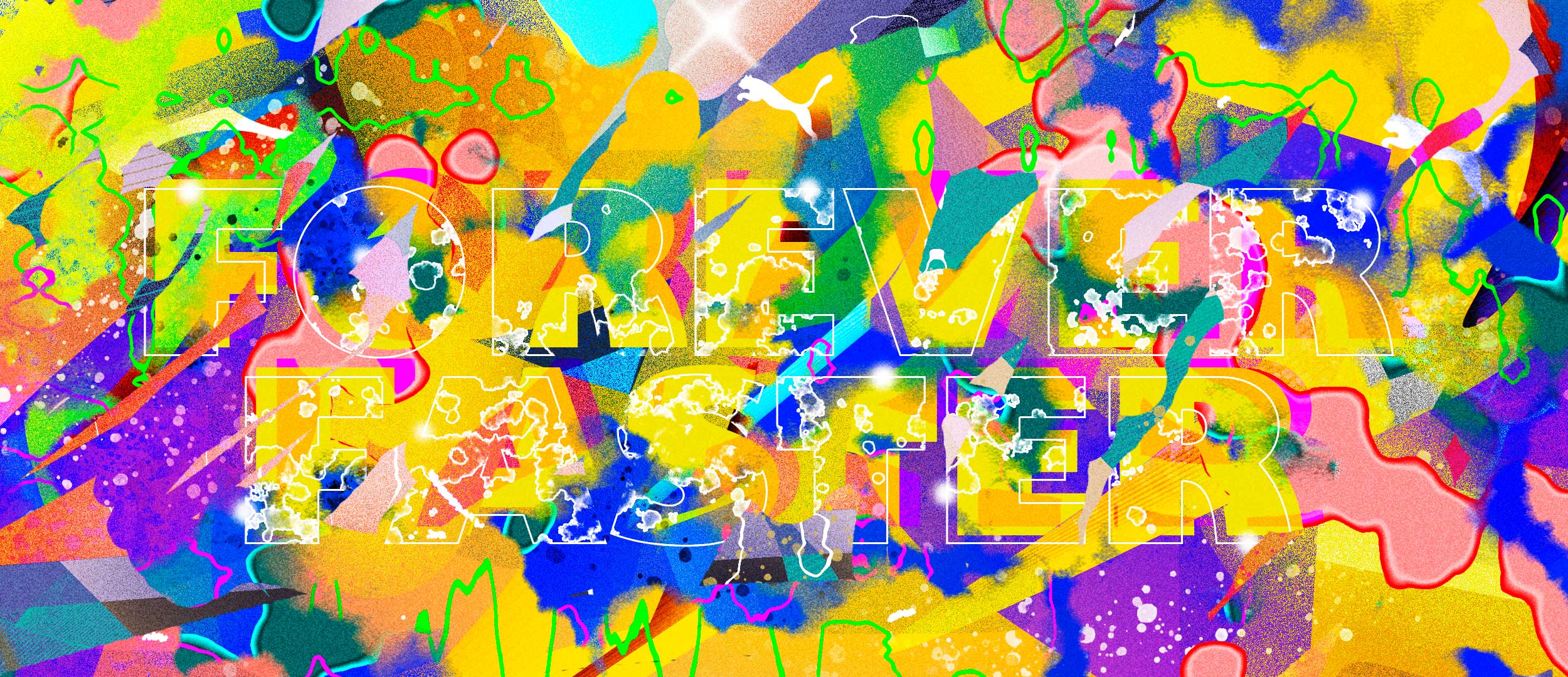
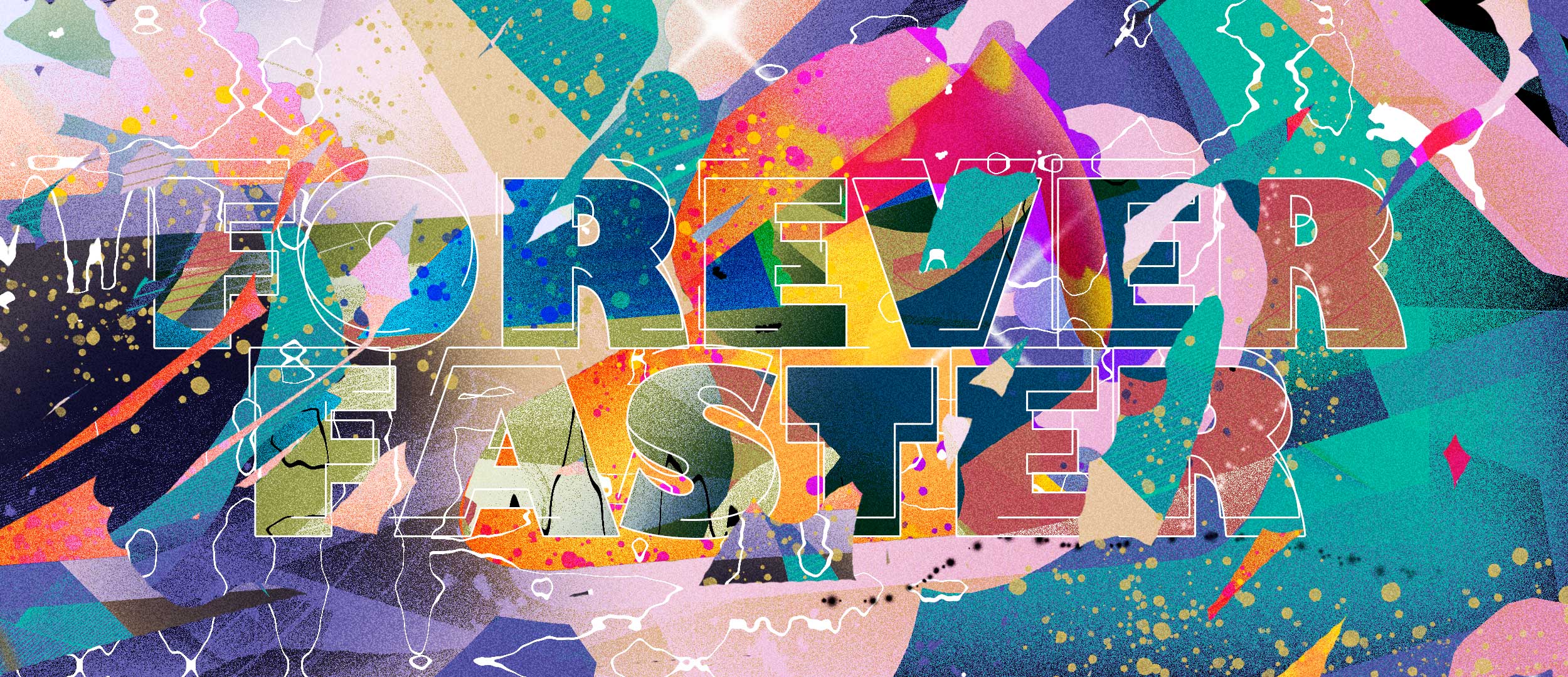
The second design approach is mainly inspired by the oldschool graffiti of the 70s and 80s and therefore again uses type as the basis for the design. In contrast to the first approach, however, I used the claim "Forever Faster" by Puma and also used different fonts for the design. This way, the many different colours, the drips, and the many colour fragments created a very playful and colourful look.
Loop Example
Design
Social Assets -Animation Preview
Posters
Design Exploration
Typography vs. Glitches
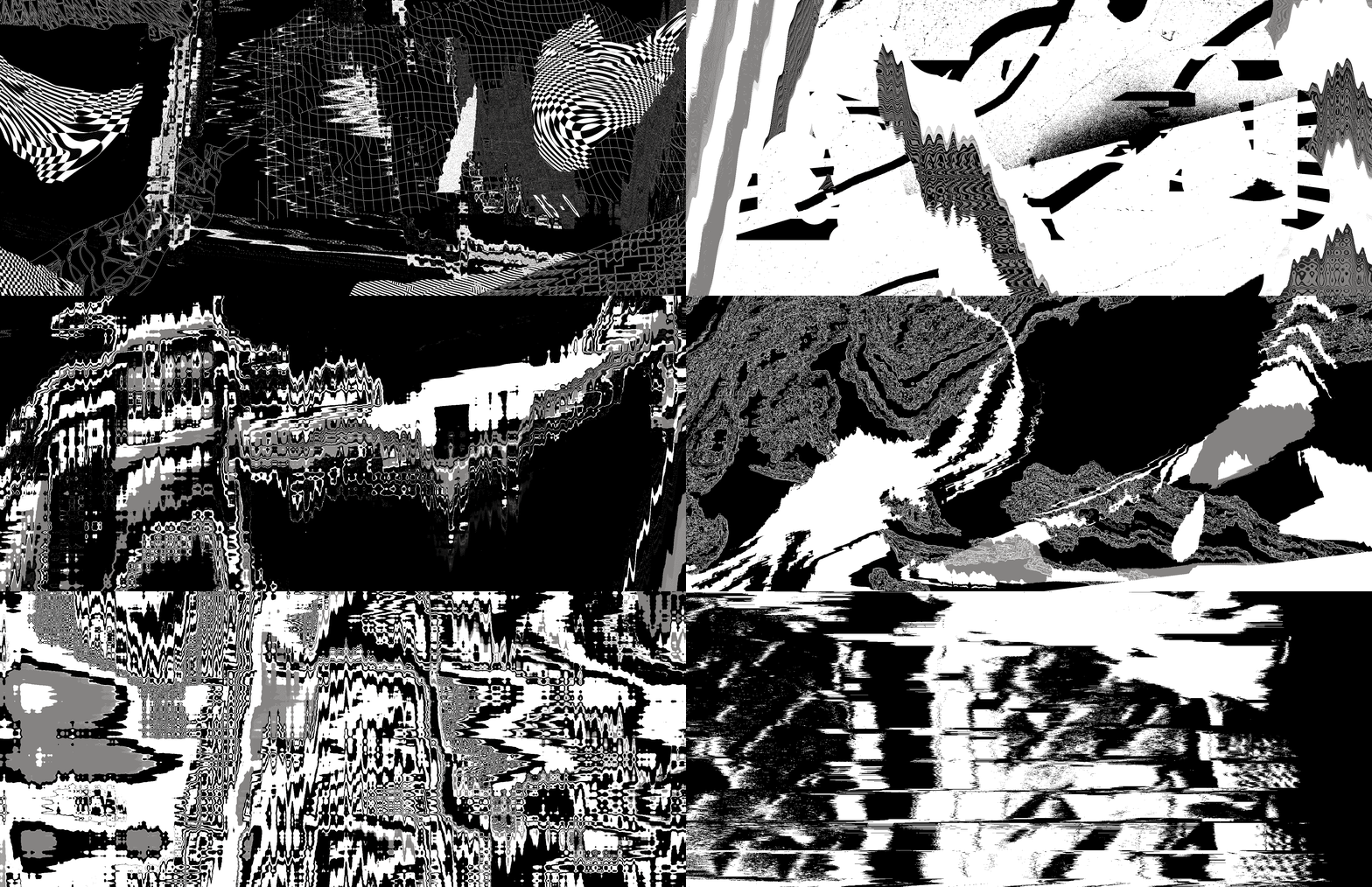
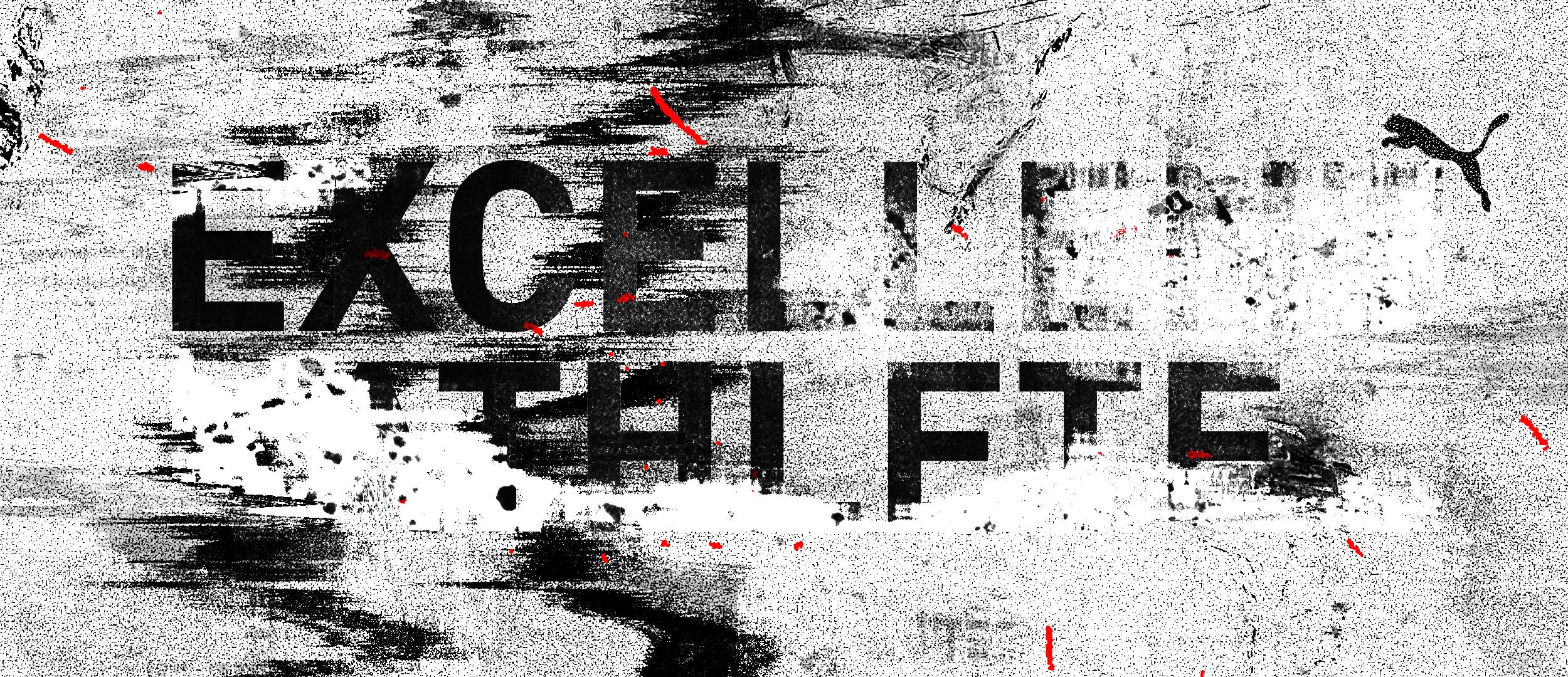
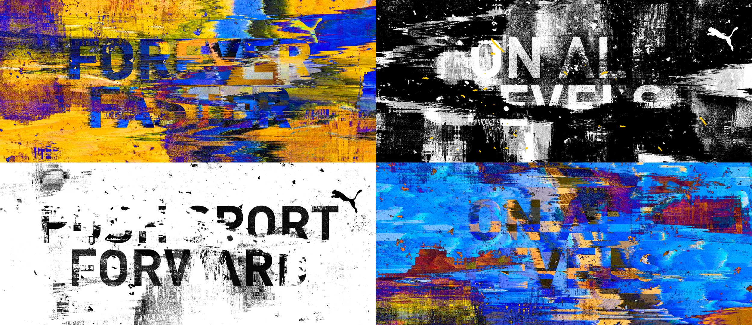
In addition to developing the two corporate identities for the "RS-0" collection, I also designed some style frames on the interaction of typography and visual glitches. These were to be used for various uses on displays in the store.
Glitch Variations
Credits
Client: PUMA SE, My task: Concept, Creative Direction, Design & Animation, Styling & Production Assistent: Aline Hollstein
© 2025 Florian Stumpe, Privacy Policy, Imprint